
A popular indignant refrain among certain disaffected Democrats and progressives following the disastrous 2016 election is to point out that Clinton won the popular vote. It is true that at time of writing she leads Trump by more than 2.5 million votes nationally; and that’s nearly five times the margin that Gore had over Bush in 2000, the last time the popular and electoral votes disagreed. How then could Clinton have lost the Electoral College so roundly unless it were a truly undemocratic or even sinister distortion of the popular will?
Though there certainly are valid criticisms of the Electoral College which one could use to argue against its continued existence, it turns out that the raw number of the national vote in 2016, while stunning, isn’t one of them. The furore over the disconnect in 2016 made me wonder about a far more useful measure of election turnout: vote share among registered voters, especially as compared with previous elections [1]. A rigorous statistical analysis of the available data suggest that the collapse of the Democratic coalition is alone to blame for its electoral defeat in 2016.
2016 Registration estimation and turnout
The vote share of a given candidate (or her party) is defined as the percent of the registered voters who voted for that candidate in an election. To truly understand the election results under the system of the Electoral College, we need to compare the data state by state. The registration rates for each state have been faithfully recorded for each federal election by the Census Bureau and are available for download from their website going back to 1960. The results for 2016 have not yet been certified, but it is possible to estimate them based on historical trends [2].
Going back as far as 2000 seemed a reasonable choice since that was the election of the last (and first in modern times) popular vote disagreement. Providentially, 2000 is also the first year the Census Bureau has made available the registration data in readily consumable formats like CSV and Excel in addition to scanned PDF.
I applied several regression analyses to compare residual accuracy: linear, quadratic, polynomial up to the fifth degree, and exponential. Given the sparsity of the data set — four points per state — it is no surprise that higher order polynomials, typically cubics and quartics, generated better-fitting curves. But since there’s no reason to suppose they accurately model registration rates over time, it was more interesting to consider the lower order and exponential regressions. Interestingly, the majority of quadratic regressions had negative leading coefficients, suggesting that the growth of registration rates has been declining in recent times.
Most significantly, the linear and exponential regressions closely agreed in their predictions for 2016 registration rates and had similar average residuals. Ultimately, considering the short time span over which the data were sampled as well as the degree to which the ease of interstate migration probably dilutes purely exponential growth rates, the linear regression seemed the most prudent to adopt for estimating 2016 registration among the states. The data so assembled are available in JSON format here. A few interesting examples follow.
Similar data for presidential election votes, broken down by state and party and also going back to 2000 in readily consumable formats, are available at the website of the federal archives. While the 2016 election is closer to being certified than the official registration rates, it’s still a challenge to find that data in a tabular format. David Wasserman of CookPolitical and contributor to FiveThirtyEight has been maintaining a weekly-updated spreadsheet [3] which passes muster when spot-checked against other sources like Politico’s visual interface. My compilation of these data, current to November 30th and in JSON format, are here.
Comparing Aggregated Vote Shares
With these data in hand, it’s a simple task to calculate the voter share by state and party for each presidential election in the 21st century, admittedly with some haziness for 2016. Since a motivating charge for this analysis is that Clinton won the nationwide popular vote, perhaps it’s best first to consider what these data tell us about those overall trends.
We can easily roll up the statewide registration data nationwide, do the same with the votes by party, and compare change in voter share by party in 2o16 with that from previous elections.
| Year | Democrat | Republican | Third Party | Total |
| 2012 | -2.34% | -0.75% | +3.07% | -0.03% |
| 2008 | -6.97% | -1.93% | +3.25% | -5.65% |
| 2004 | -1.16% | -4.86% | +3.9% | -2.16% |
| 2000 | +1.03% | -0.14% | +1.69% | +2.58% |
Nationwide, Clinton obviously did better than Gore in 2000, but only by one percent of Democratic vote share. Meanwhile, Trump only lost only about 1/7th of one percent of Bush’s take that year. That 1.2% spread is the difference between half a million votes in 2000 and 2.5 million in 2016. The idea that populists flocked (as least uniquely) to Trump nationwide to elect him is debunked: he got a lower share of the vote than any 21st century Republican. And combined third party voting was stronger in 2016 even than in 2000 when Nader “threw” the election to Bush. In fact, relative turnout is higher in 2016 only when compared with 2000, and that’s mostly due to third party voting (already unusually high in 2000).
The huge spike in third party voting helps us to understand why considering the national popular vote is unhelpful under the Electoral College system. After all, no Third Party candidate won even a single electoral vote. Much more interesting is the change in statewide share averaged across the states.
| Year | Democrat | Republican | Third Party | Total |
| 2012 | -3.86% | -0.77% | +4.14% | -0.49% |
| 2008 | -8.44% | -1.37% | +4.36% | -5.44% |
| 2004 | -2.63% | -4.53% | +4.84% | -2.33% |
| 2000 | -0.27% | -0.26% | +2.22% | +1.69% |
This paints a more dismal picture for the Democrats, who actually lost about 0.01% more share on average than did the Republicans as compared with 2000! In fact, the Democrats lost more share in 2016 on average than did the Republicans as compared with every election except for 2004, a referendum on the almost comically unpopular Bush (which Democrats still lost). By either measure, nationwide or statewide average, overall turnout was down more than 2% as compared with 2004 too; in other words, removing Bush by way of Kerry was a more enticing proposition than #NeverTrump by way of Clinton. But lest that be interpreted in terms of racist or sexist support emerging from the woodwork for Trump, another popular drumbeat on the left, note that retaining Bush in 2004 netted close to 5% more nationwide share than electing Trump in 2016 did.
Considering average share makes it even easier to see that the rise in turnout as compared with 2000 — note that it was a fall everywhere else, even compared with the relatively depressing 2012 election — was down to third party voting. But it clearly wasn’t that voters abandoned Democrats in order to cast protest votes, or at least not any more than Republicans did. Even if we allow that all the lost share from 2000 for both major parties was recast elsewhere in 2016, that still only accounts for less than a quarter of the rise in average statewide third party share. Put another way: to the extent that anyone turned out this year, it was nonpartisans that came out of the woodwork to repudiate Clinton and Trump both in 2016.
Comparing Statewide Vote Share
Aggregated totals, either nationwide or averaged over the states, still don’t tell a robust story of how the Electoral College was so roundly lost even while the popular vote was won by Clinton. For this, we must turn to a state-by-state review of share changes. But the matrix is already wide enough just considering four elections across four voting decisions aggregated nationally (two major parties, combined third party voting, and abstention by implication through considering total share regardless of party). Considering each state independently greatly complicates this, especially since most states are not in play for the Electoral College but might still provide insight for any number of reasons.
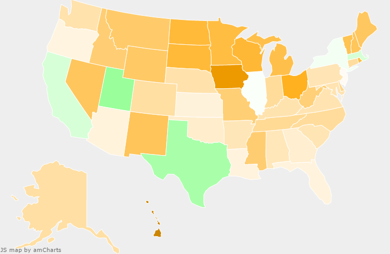
Luckily, heat maps help quickly identify both outliers and typical cases. amCharts.com provides an open source US heat map that greatly aids visual analysis of the data with the need for only a few tweaks and a basic custom UI layer to interactively consider the share differences between elections. Frankly the data are so rich that the reader is encouraged to play with the heat map herself (available on our sister site, afewbitsmore.com), or even two copies side-by-side to compare comparisons, but I offer what were for me the most interesting takeaways. An important note for all these maps: green means a positive change, orange means a negative change; and the greater the color saturation, the larger the absolute value of the change. And recall again that all share rates in 2016 are projections based on as-yet-uncertified popular vote numbers and registration rates.
Third Party Vote, 2000 ~ 2016
Since a major theme here and elsewhere has been the role of the third party vote in 2016, especially as compared with 2000 for reasons already stated, it’s interesting to consider the change in third party share between those years.
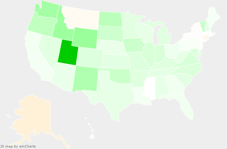
The standout is obviously Utah, which elected Trump but voted roughly as much for independent (and Mormon) challenger Evan McMullin as for Clinton [4]. Ignoring Utah only drops the 2016 gain in statewide average third party share over 2000 from 2.22% to 1.85%, but that’s still a good way to see how aggregated statistics can be misleading.
Nevertheless, every state voted about as much or more for third parties in 2016 as compared with 2000 except for Alaska, Connecticut, and perhaps Montana (which lost less than a percent of third party share). Clinton won 4% more share than Gore in Alaska while Trump lost more than three times that from Bush. Montana’s drop in turnout seems to have stolen (decently) from Trump and given (slightly) to Clinton. Connecticut on the other hand was purely lossy; but while Trump lost only 1.5% from Bush, Clinton lost 6.5% from Gore. None of these three states flipped across those years, but they’re good examples of how unpopular both candidates were among relative partisans even in states which didn’t defect to third parties.
Contested Elections: 2000, 2008, and 2016
Between major parties, there are two flavours of comparison: contested elections, when neither party has an incumbent due to term limits; and uncontested elections (in two flavours again) when one party is running for reelection. Since 2016 was contested, 2000 and 2008 are the most germane comparisons this century.
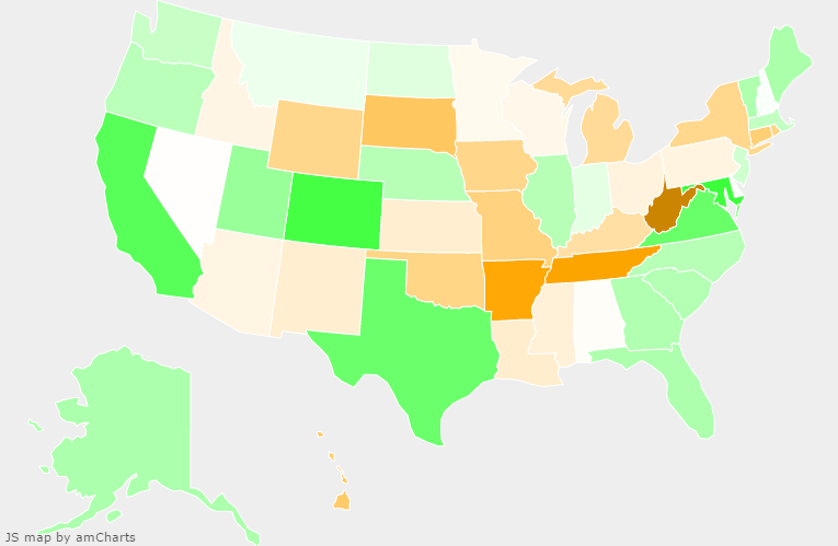
Because 2008 was the year of Obama’s relative landslide, it’s interesting to consider the Republican share shift between 2008 and 2016.

Frankly, this is an embarrassing map for Republicans, with only modest improvement over McCain 2008 and only in generally reliably-Republican states. The clear outlier is North Dakota which preferred Trump to McCain by 15 points, an interesting data point in the context of the DAPL protests. Otherwise, only Maine and West Virginia preferred Trump to McCain by more than 5% (though Nebraska was close at 4.5%). But Trump losses to McCain nearing or exceeding 5% abound: Alaska, Arizona, California, Georgia, Idaho, Kansas, Massachusetts, Mississippi, New Mexico, Tennessee, Utah, Virginia, and Washington. In this context, only Obama’s phenomenal popularity can explain his victory over an otherwise popular McCain; and Clinton’s loss to Trump is all the more devastating [5].
Next we consider the shift between 2000, a narrow Democratic electoral loss, and 2016, a wide one, to better understand both electoral failures.
A lot has changed since 2000, but we can identify Clinton’s three biggest black eyes very easily:
- West Virginia (-14.4%) – Coal-hating was both proper and unpopular, so there was just no winning here.
- Tennessee (-12.2%) – This is Gore’s home state, so he likely had an otherwise undeserved bump in 2000.
- Arkansas (-11.7%) – Dear god, this is the Clintons’ home state!
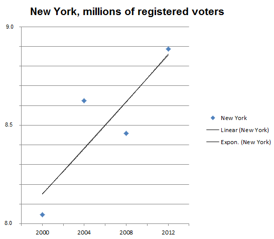
None of those states went Gore in 2000 but they do represent a profound loss of share for the Democrats. A similar observation is that New York, the state which elected Senator Clinton in 2000, gave her more than 5% less vote share in 2016 than they did Gore in 2000.
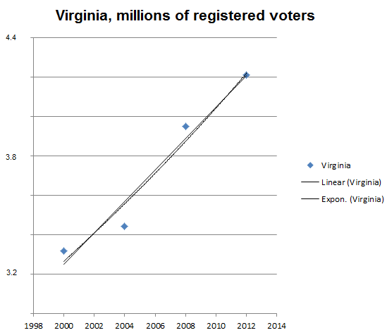
Two states with obvious bias for Clinton as compared with Gore did flip parties to vote for her: Colorado and Virginia. But four states showing significantly less bias toward Trump as compared with Bush flipped to vote for him: Iowa, Michigan, Pennsylvania, and Wisconsin. If those states sound familiar, it might be because three of them were the target of Jill Stein’s controversial push to seek recounts. Democrats carried all three of those recount states in every election since 2000, and they only didn’t carry the fourth Clinton loss (Iowa) in 2004. So unless something nefarious comes of those recounts, Clinton lost (quite dramatically, as we shall see) in several midwestern states that reliably voted Democratic before her.
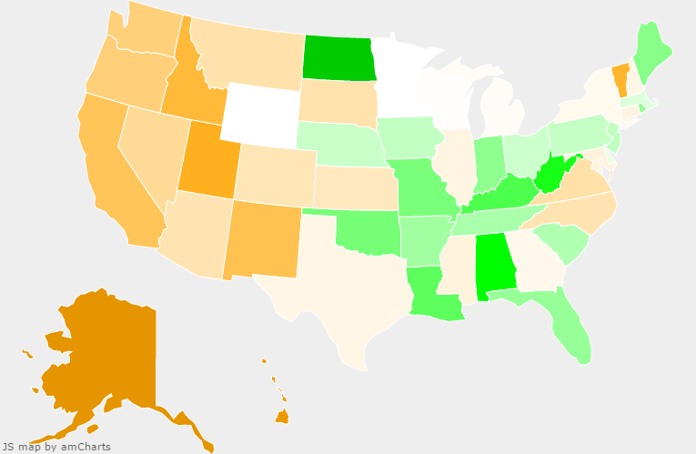
Meanwhile, some of Trump’s strongest performances as compared with Bush 2000 look compellingly like direct steals from “Blue Dog” Democrats in the South and Midwest: West Virginia (+11.1% Republican, -14.4% Democrat), Kentucky (+8.6% Republican, -4.3% Democrat), Missouri (+6.5% Republican, -6.0% Democrat), and Oklahoma (+6.6% Republican, -5.7% Democrat). And in several Southern states, new voters played an interesting role in overall share. Trump dominated a couple: Alabama (+13.5% turnout; +12.3% Republican, -0.3% Democrat) and Louisiana (+6.3% turnout; +7.8% Republican, -2.4% Democrat). Clinton did similarly well in Texas (+7.3% turnout; -1.3% Republican, +6.9% Democrat). And two states maintained their ratios but leaned slightly Republican: Florida (+9.8% turnout; +5.0% Republican, +3.9% Democrat) and South Carolina (+9.2% turnout; +3.7% Republican, +3.6% Democrat).
The bottom line is that Clinton failed to pick up any of Bush’s meaningful prizes nominally in play in 2016 like Florida (46.3% Trump, 45.2% Clinton), and lost some big ones like Pennsylvania (41.7% Trump, 41.1% Clinton) and Michigan (38.7% Trump, 38.5% Clinton). A few states were shuffled around to no effect: Trump picked up Iowa and Wisconsin but lost Colorado and Nevada. Clinton’s biggest Bush steal, perhaps down to her running mate being its former governor, was Virginia (43.8% Clinton, 39.1% Trump). Maybe the most surprising result of the entire election was how close Texas came to being in play. Republican share hovered in the low 40s between 2000 and 2016, but Democratic share jumped from 27% to 34%. That was as impressive a showing there as Obama had in 2008, put Texas about as close as Ohio to going blue in 2016, and would have swung the electoral vote to Clinton had she won it.
The Democratic Party Collapse of 2016
The last comparison I’ll call out is the difference in Democratic share from 2012 to 2016. While that election was uncontested by Democrats, it’s germane for three reasons: it’s the most recent to compare against, it was much closer by both popular and electoral vote than was 2008, and perhaps most importantly it’s the only other election conducted with the same House apportionment and hence the same distribution of electoral votes across the states.

This is the sad truth of the efficacy of #NeverTrump. Basically no one (except the national popular voters?) bought it. Only four states gave Clinton 2016 above 1% more share than they gave Obama 2012: Utah (+4.0%), Texas (+3.4%), Massachusetts (+1.6%), and California (+1.6%). Only two other states gave Clinton 2016 any more share than Obama 2012 (and neither is statistically significant): her adopted home state of New York (+0.5%), and Obama’s home state of Illinois (+0.2%). Overall turnout was up at least 3% in all six of those states except California where it was virtually unchanged (-0.2%). Trump did worse than Romney 2012 in all six except his home state of New York where he picked up nearly 5%, but that was still only slightly better than McCain 2008. And Clinton’s biggest single loss from Obama 2012 was his (still blue) original home state of Hawaii, where third party share went up 4% and Democratic share went down three times as much. Charges of statistically significant voter suppression predominantly harming turnout for Democrats, if accurate, implicate virtually every state in the union. Given the huge surge in third party voting, that just isn’t the most plausible explanation.
Here’s how Clinton lost: she didn’t win any states that Obama didn’t carry in 2012 and Trump converted a few that he did. In addition to those already mentioned (Iowa, Michigan, Pennsylvania, and Wisconsin), Clinton lost Florida and Ohio, the same states that spelled defeat for Gore 2000 and Kerry 2004, respectively. But it isn’t the case that baskets of deplorables lined up to cheer Trump into office. He gained above 1% share over Romney in only half those states: Iowa (+2.7%), Pennsylvania (+2.3%), and Michigan (+1.1%); and he actually lost 0.9% in Wisconsin. But Clinton’s best performances in those states saw her losing more than 1% as compared with Obama 2012, and most losses were downright devastating: Michigan (-7.1%), Wisconsin (-8.0%), Ohio (-8.8%), and Iowa (-10.8%). Trump won these states because Clinton lost them at least five times worse.
Clinton’s lost votes went to varying combinations of Trump (in Iowa and Pennsylvania), depressed turnout (except in Florida and Pennsylvania), and third parties (across all six). Consider the share changes in these states between 2012 and 2016, as well as the the popular vote share margin by which Trump carried the state:
| State | Dem. | Rep. | Third Party | Total | Margin |
| Florida | -1.36% | 0.59% | 2.18% | 1.41% | 1.13% |
| Iowa | -10.78% | 2.68% | 4.95% | -3.15% | 8.19% |
| Mich. | -7.1% | 1.08% | 3.35% | -2.66% | 0.18% |
| Ohio | -8.83% | 0.94% | 2.6% | -5.28% | 7.04% |
| Penn. | -2.94% | 2.28% | 1.98% | 1.32% | 0.66% |
| Wis. | -7.98% | -0.9% | 4.42% | -4.55% | 0.66% |
In four of these states, Trump’s margin of victory was tighter than combined third party voting: Florida, Michigan, Pennsylvania, and Wisconsin. But before we declare that third parties cost Clinton the election, consider that, absent compelling third party candidates, would-be third party votes are either split across the major parties or go uncast. In 2016, there were two third party candidates who garnered decent national attention and statistically significant turnout. To reverse the election result in Florida and Pennsylvania, half or more of third party voters there would have needed to vote Clinton; but given that right-leaning Libertarian Gary Johnson got three times the votes of the Green Party’s Jill Stein in both, Trump would have probably done even better there without a viable third party option. And in Michigan and Wisconsin, reduced turnout was about as big a factor as combined third party voting. Considering that between 5 and 20% of projected registered voters didn’t cast ballots at all in those four states — to say nothing of voting-eligible adults in general — it makes much more sense to blame Clinton’s losses there on turnout rather than third party voting.
Conclusions
Hillary Clinton lost the Electoral College in 2016 even as she won the national popular vote mainly due to stunning losses in the midwest. One may criticize the anti-democratic forces of the Electoral College, but only twice in modern history have the popular and electoral votes disagreed. As a practical matter, I see the Electoral College as fulfilling a valuable purpose: namely, to prevent the tyranny of an increasingly consolidated urban majority by forcing campaigns to appeal to geographically diverse constituencies. This has been possible in the last quarter century for all but the most uninspiring of Democratic candidates. Surprise surges over 2012 share in Texas and Utah didn’t flip those states, and slight increases in California and Massachusetts were in the last places they could help.
But Clinton’s loss in 2016 is deeper than electoral voodoo run amok. Obvious deficiencies in her campaigning, and in the process by which the Democratic Party nominated her in the first place, led to large scale abandonment of the Democratic party across the country and the loss of six states from Obama’s 2012 coalition. Dissatisfaction with both major party candidates led to levels of third party voting unprecedented in this century. But to blame third party voting for Clinton’s loss in 2016 is at best misguided, and to claim that racism or sexism are primarily behind it is to cynically ignore reality: Clinton simply did not appeal to enough democrats and independents, particularly in the midwest. With a candidate as repulsive and unpredictable as Trump, this was the Democrats’ election to lose; and with Clinton as their nominee, they did lose it.
Footnotes
[1] Another interesting metric would be to compare party turnout to the pool of all eligible voters, but registration is a better metric for understanding the intention of the electorate. The registration rate is a good proxy though for gauging the national mood and the relative stakes the candidates represent by considering only those election-eligible adults nominally engaged in the process. [UPDATE] Read here for a much more involved analysis on this point.
[2] Such estimation may prove to be ultimately inaccurate if it turns out there was in fact a massive registration surge ahead of this year’s election; but if that did indeed happen it only serves to make the relative turnout even lower. The alternative, that even fewer people registered, would support the (likely) assertion that that absolute turnout growth diminished relative to previous elections, but that just means the election is even more unrepresentative of the ineffable will of the people at large (except to say that even more people than usual found it to be irrelevant). From this, it seems at least not unreasonable to assume 2016 was typical registration-wise.
[3] One unfortunate limitation of Mr. Wasserman’s spreadsheet is that it combines all third party voting into an ‘other’ column, while the federal archive voting data faithfully records votes for individual third party tickets. Teasing apart the various parties could have been an interesting exercise but would further complicate the matrix, especially if parties other than just the Libertarians and Greens were to be considered. Since no third party has carried a single state in nearly 50 years, ‘other’ seems adequate for now.
[4] Utah doesn’t necessarily vote for the Mormon as a bloc. Romney 2012 won 11.03% more share than Bush 2000 when 54% of registered Utah voters chose Bush and 8.64% more share than McCain 2008 when 56% of registered Utah voters chose McCain, but in 2016 43% voted Trump to McMullin’s 26%. In all other years, the Utah third party vote was in the mid-to-low single digits.
[5] It goes without saying that the map comparing Obama 2008 to Clinton 2016 is just sad shades of orange across all 57 states. It’s hard not to read this as validation for positive campaigning (“Yes We Can!”) over negative campaigning (“Never Trump!”), and it is the clearest way to see racism charges as off base. Interestingly, the only state to lose third party share from 2008 to 2016 was New York. That was not down to a home court advantage for either major party candidate though; Democrat share was down nearly three times as much there and overall turnout was down even more than that, while Trump did only about as well there as McCain did.
I like what you guys are usually up too. This kind of clever work and reporting!
Keep up the terrific works guys I’ve you guys to my personal blogroll.