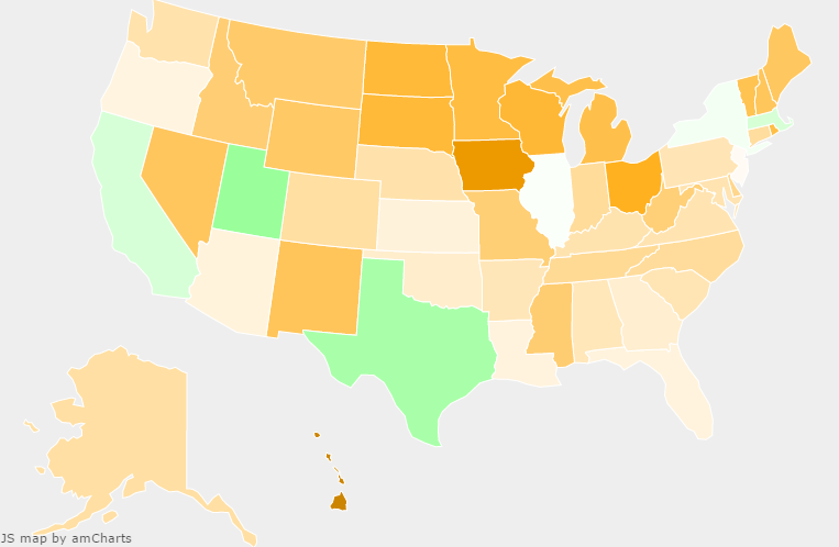
A popular indignant refrain among certain disaffected Democrats and progressives following the disastrous 2016 election is to point out that Clinton won the popular vote. It is true that at time of writing she leads Trump by more than 2.5 million votes nationally; and that’s nearly five times the margin that Gore had over Bush in 2000, the last time the popular and electoral votes disagreed. How then could Clinton have lost the Electoral College so roundly unless it were a truly undemocratic or even sinister distortion of the popular will?
Though there certainly are valid criticisms of the Electoral College which one could use to argue against its continued existence, it turns out that the raw number of the national vote in 2016, while stunning, isn’t one of them. The furore over the disconnect in 2016 made me wonder about a far more useful measure of election turnout: vote share among registered voters, especially as compared with previous elections [1]. A rigorous statistical analysis of the available data suggest that the collapse of the Democratic coalition is alone to blame for its electoral defeat in 2016.

