techniques for comparing relative election turnout

Earlier this month I published a deep dive into the evolution of presidential elections in the 21st elections. The primary motivation for that, aside from better understanding the shocking result of Trump’s victory over Clinton, was to analyze the widely made observation that Clinton won the popular vote by a particularly large number of votes. Around the time of that publication, updated vote tallies from a few large states (California, New York, and to a much smaller extent Pennsylvania) allowed for another shocking headline: Clinton won more votes than Obama did in 2012.

That headline (correct though it was by 90,000 votes, or 0.15% more than Obama’s 2012 haul) served to further distract from the thesis of my piece, which was that Clinton’s campaign resulted in a significant relative dip in Democratic turnout across virtually all states. But amid the drumbeat of considering absolute vote totals across elections, one criticism of my approach was to question the utility of performing a relative analysis at all. And if it was going to be made, why choose overall voter registration to  factor significantly into that analysis? This post more thoroughly considers the motivations for and alternatives to these choices to better explain why these methods probably best help us to measure differences between presidential elections.

Continue reading “techniques for comparing relative election turnout”

Clinton’s 2016 defeat explained: a statistical analysis of 21st century presidential elections

A popular indignant refrain among certain disaffected Democrats and progressives following the disastrous 2016 election is to point out that Clinton won the popular vote. It is true that at time of writing she leads Trump by more than 2.5 million votes nationally; and that’s nearly five times the margin that Gore had over Bush in 2000, the last time the popular and electoral votes disagreed. How then could Clinton have lost the Electoral College so roundly unless it were a truly undemocratic or even sinister distortion of the popular will?

Though there certainly are valid criticisms of the Electoral College which one could use to argue against its continued existence, it turns out that the raw number of the national vote in 2016, while stunning, isn’t one of them. The furore over the disconnect in 2016 made me wonder about a far more useful measure of election turnout: vote share among registered voters, especially as compared with previous elections [1]. A rigorous statistical analysis of the available data suggest that the collapse of the Democratic coalition is alone to blame for its electoral defeat in 2016.

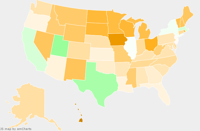
In this image, green means good for Democrats and orange means bad. Who do you suppose won this election?

Continue reading “Clinton’s 2016 defeat explained: a statistical analysis of 21st century presidential elections”